CSS Sprites Are Cool
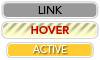
Before i get into a long "tut" about how sprites work, let me first start with an example of what they are... And just so you can see all the fuctionality, be sure to click on one of the links. it wont take you anywhere. you'll just get to see the "active" state.
Example: CSS Sprites
Just looks like a regular roll-over right? Right! but the beauty of this little doo-hickey is that:
- All the links are actual text, styled by CSS of course
- All the background images are contained inside 1, count'em 1 image file
- Loading times are cut down dramatically, because instead of loading 3 separate images, you are only downloading 1 and replicating it 3 times
- Files are easier manage for you, the webmasta, coz you just have 1 file to edit, upload and replace
Enough Already! How do you DO it?
Keep your shirt on! the answer is simple. REALLY simple.
First of all, understand that we are using the CSS pseudo-classes :link, :hover, & :active to style each state of the <a> tag. If you don't get what pseudo-classes are, ooh boy you in trouble! go read about them and come back here later
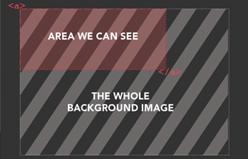
Ok, moving on... Using CSS we can make ANY html tag have ANY background image we desire. we can have it repeat once, or have it repeat as many times as we'd like in either the x-axis or the y-axis too. when you place an image as the background of a tag the starting position of the image is always at the top left-hand corner (of course!) of the tag. How much of the image shows is dependent on the size of the "window". check this image, hepcats!
Example: Starting position of an image as a background
Most likely, you know this already... and if you do, cool! did you also know you can use the "background-position" property to change the starting position of the image inside the <a> tag? Let me show you what happens when you do that in the image below
   	  		 Example: what happens when you change the background-position property
            /*####  CSS CODE   ###*/
            	a{
                	background-image: url(background.jpg);
                    background-position: -20px -10px;
                }
             /*####  HTML CODE ###*/;
             	<a href="link.html">Link One</a>

             /*####  RESULT   ###*/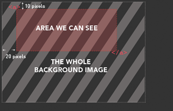
The "background-position" property in this example moves (believe it or not) the POSITION of the BACKGROUND, 10px up and 20px to the left so that we are seeing a new section of the background image. The first number adjusts the x-position of the image (use a negative number to move it to the left, a positive one to move it to the right) the second number adjusts the y-position (negative moves the image up, a positive one, down). Now can you see where we are heading with this?. All we are going to do now is use the pseudo-classes :link, :hover, & :active to change the starting position of the background image inside the window.
My Example
Heres the png that i created inside photoshop. you can download it here but you really dont need to to understand what is going to happen later...
Example: My Awesome sprite image
I set up the image so that each of the areas were all 20px high... that way i would know how far to move each image
Example: My Awesome sprite image close up
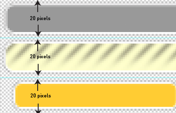
All that's left is to write the css that controls what part of the image shows in each state. this should be fairly self-explanitory
			My Markup and CSS
                /*####  CSS CODE   ###*/

                #spritenav{
                list-style: none;
                }


                #spritenav li a{
                display: block;
                background: url(img/css-sprite.png) no-repeat 0 0;
                padding: .35em 0;
                font: .75em/1em helvetica, arial, sans-serif;
                }

                #spritenav li a:hover{
                background: url(img/css-sprite.png) no-repeat 0 -20px;
                }

                #spritenav li a:active{
                background: url(img/css-sprite.png) no-repeat 0 -40px;
                }


                /*####  HTML CODE   ###*/
                <ul id="spritenav">
            	<li><a href="#">link one</a></li>
                <li><a href="#">link two</a></li>
                <li><a href="#">link three</a></li>
                <li><a href="#">link four</a></li>
            </ul>
ta-da! That's all folks.... each state has a different background position. not that hard. Right? Right!